Nakshi
A mark that reads as jewellery before it reads as a letter.
- Client
- Nakshi
- Discipline
- Identity & Packaging
- Sector
- Fashion & Jewellery
- Year
- 2025
Identity/Identity & Packaging/2025
Visit site↗Bought as a gift, decided on a phone, in a hurry. The site had a few seconds to look like the tier someone wants to be seen giving.
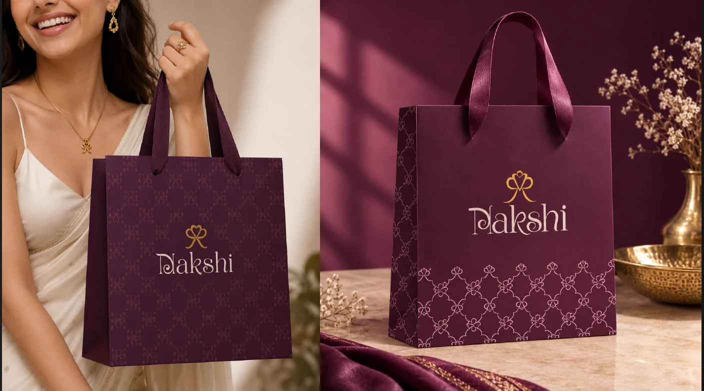
Nakshi takes its name from nakshi work — the fine detailing on traditional Indian metal and textile craft — and the identity is built to be handled rather than looked at.
The monogram is drawn as a single continuous loop so it can be foiled at any size without the counters filling in, and it is paired with a trellis repeat taken from the same curve. The retail bag is the primary application: deep plum board, tone-on-tone repeat across the body, a denser band at the base, and satin handles rather than cord — the detail that tells a customer what tier they are in before they have opened anything.
- 01Monogram & Wordmark
- 02Trellis Repeat Pattern
- 03Retail Bag & Finish Spec
- 04Foil & Colour Standards
- 05Packaging Art Direction
- 06Launch Photography Direction